A Cutting Edge Pharmacy as a New Landmark
Pharmacy’s new construction plan
In Japan, two major types of pharmacies can be found. The first is the drug store, or what can be described as retail pharmacies. This type offers services related to basic medicines as well as parapharmaceutical products. The second type is the dispensing pharmacies, usually related to a nearby clinic or hospital. In this type of pharmacies, the products are prepared in the backyard after the customer presents prescription issued by his doctor. Once prepared, the pharmacist has to explain to the customer about the prescription.
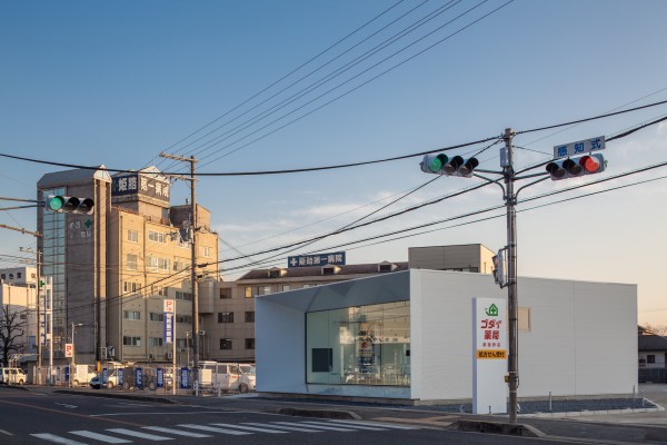
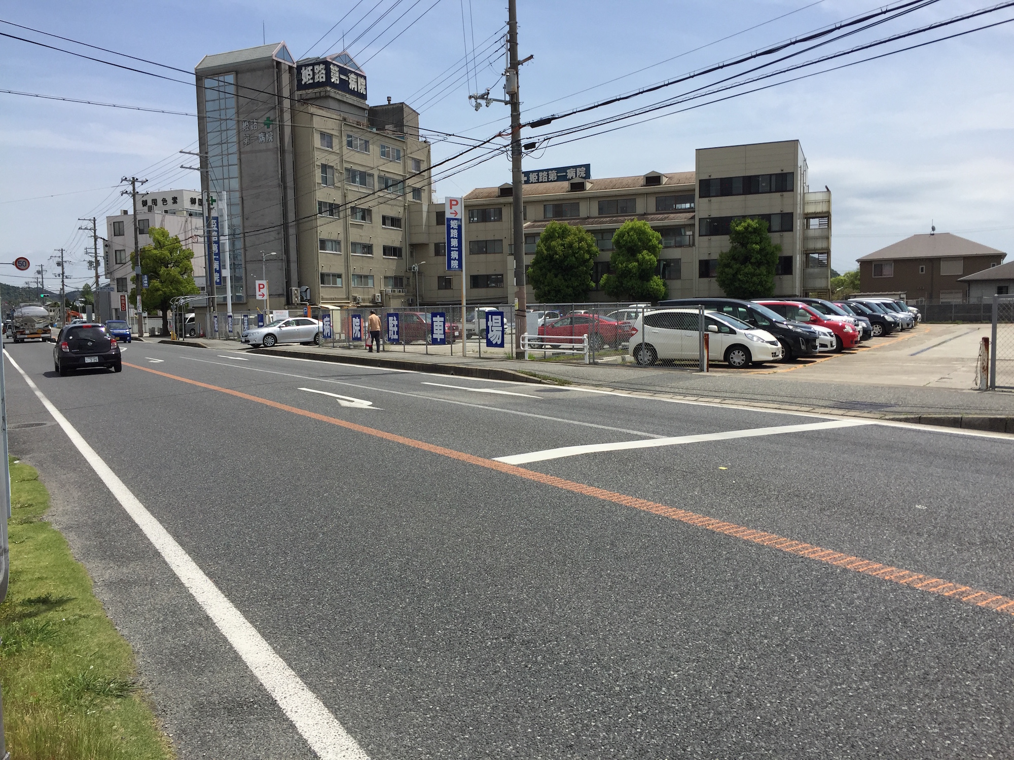
This dispensing pharmacy is located nearby a general hospital and owned by its president. The Idea behind this pharmacy is to promote the hospital by giving it a new image as it is subject to a strong competitiveness.
The starting point of this design was to question the criteria that customers use to select a pharmacy, beside the geographical location. What would make a pharmacy better than another one? The purpose of visiting a pharmacy is the same, purchasing medicines and seeking healing.
The keyword for medical related design is healing, commonly associated with peaceful nature. Subsequently, this type of design traditionally tries to incorporate natural elements like trees, green walls and flowers.
Nature is undoubtedly a source of healing, nonetheless, the simple fact of coming to a medical institution lays on the trust that the patient puts on modern medicine. The more advanced medicine is the more trustworthy it becomes; true peace of mind is reached when the medical care is at its “Cutting Edge”.
CG
Plan
Vision of “cutting-edge, high-tech medical care”
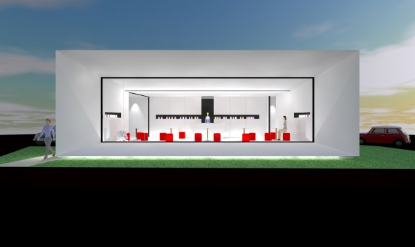
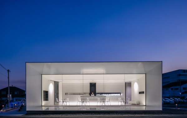
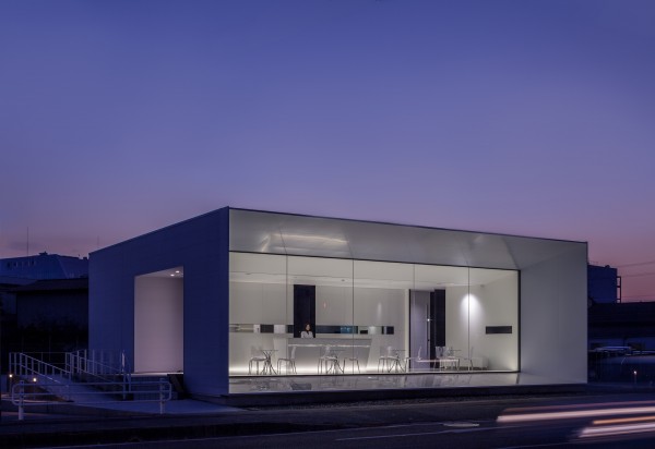
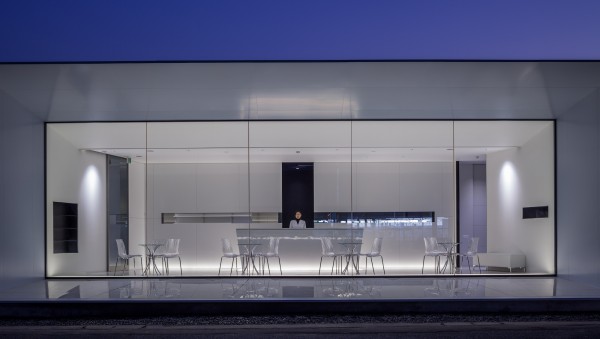
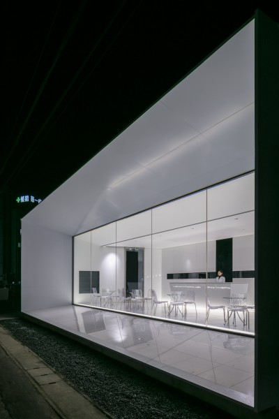
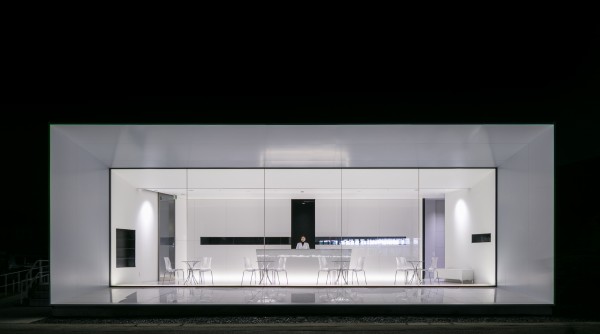
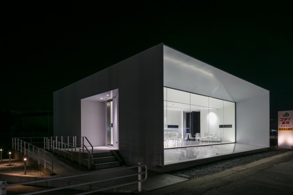
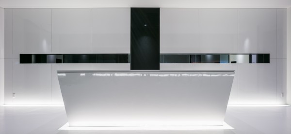
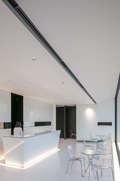
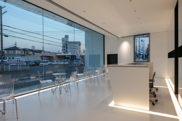
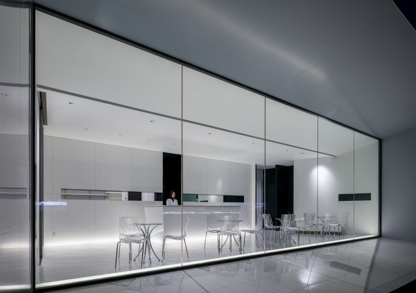
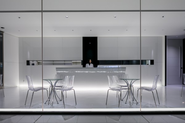
The pharmacy is situated along one of the most important streets in the region. The facade is totally glazed and contoured by protracted sharp edges. The edges are also projected into the minimalist white interior demarcated by a black cross.
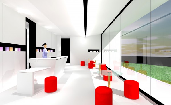
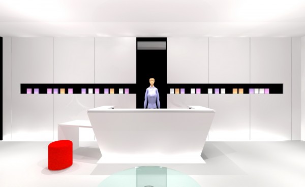
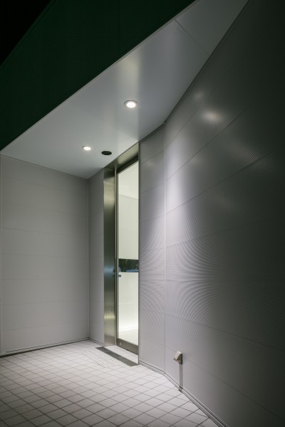
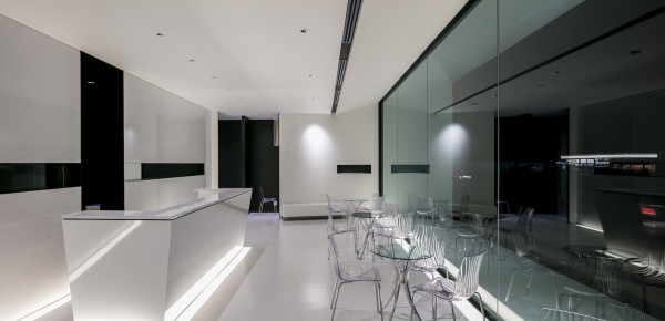
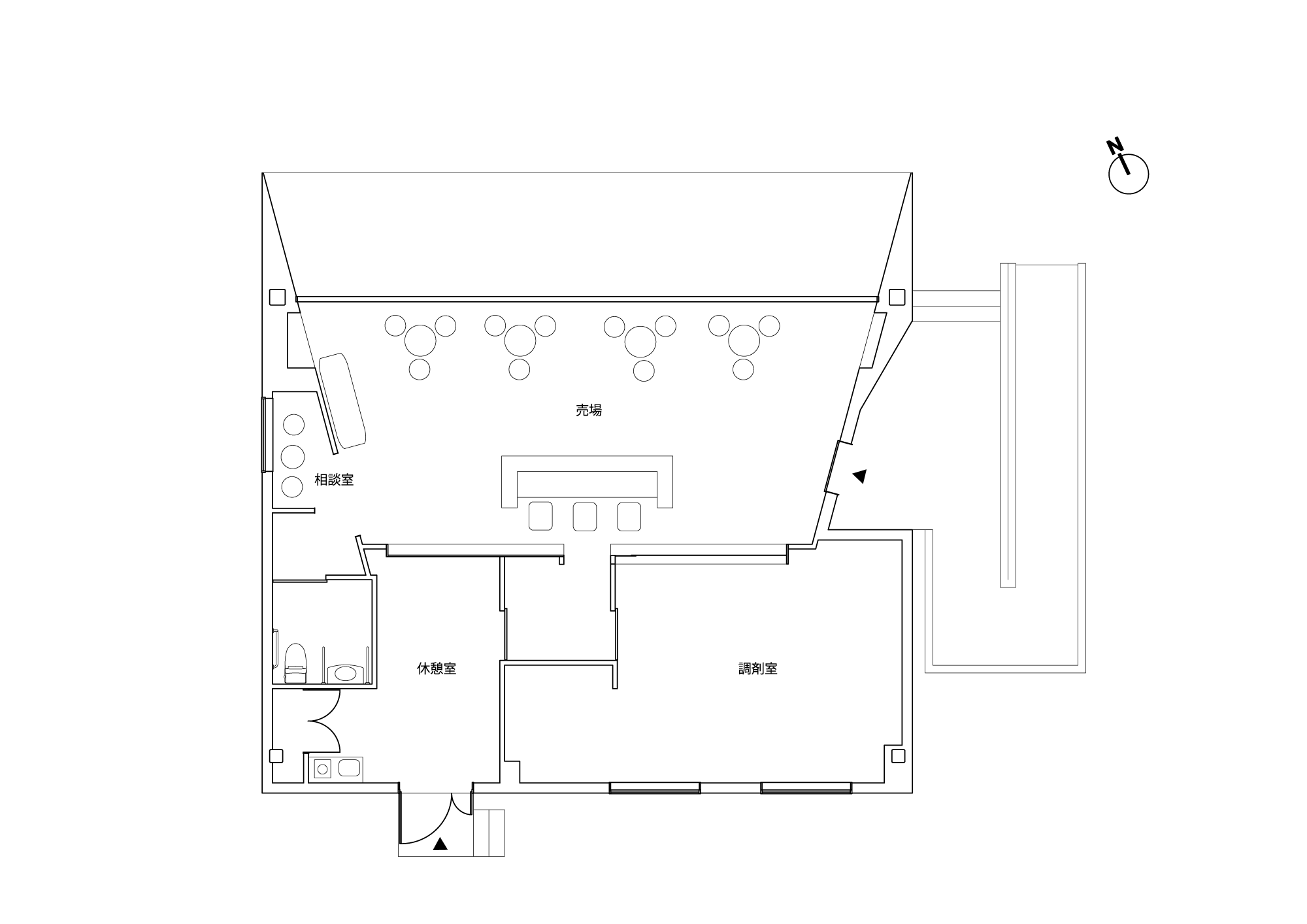
The vertical line of the cross is the gate towards the backyard where the prescriptions are prepared. The horizontal line is a console for exhibiting key products. The entrance is on the left side of the building in the direction of the hospital liberating the glazed facade from unnecessary additional lines. This minimalistic space designed in clean straight lines and enhanced with indirect lighting slits creates the High-Tech sharp image that the patient expects from an advanced medical care.

The process of providing pharmaceutical supplies
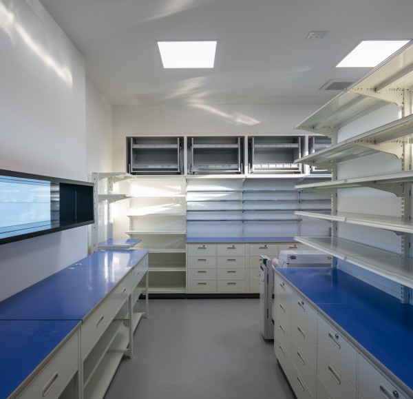
Additionally to the appearance, the quality of service is a major criterion for selecting a dispensing pharmacy, and this is not without affecting the design. Traditionally, the patient handles his prescription at the reception counter; the pharmacist will then prepare the medicines in the backyard whilst the patient is sitting in the waiting space.
Once done, the patient will be called again to the counter to get explanations about the prescription. This pharmacy differs in that the patient will not be called to the counter again. Instead, the pharmacist will meet him at his waiting space furnished in chairs and tables. These small attentions can make a big difference by providing an image of High Quality services inducing the process of healing.
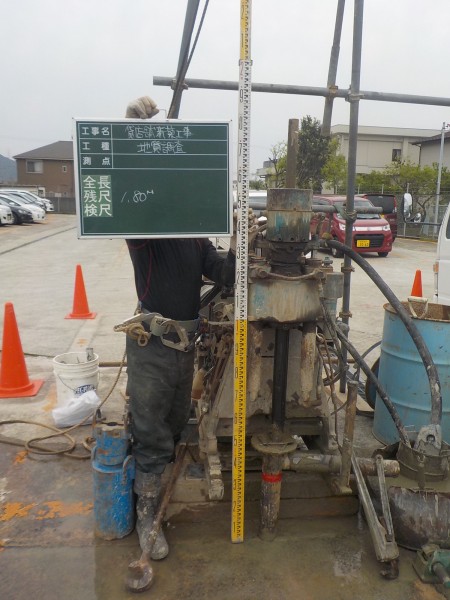
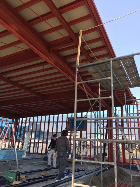
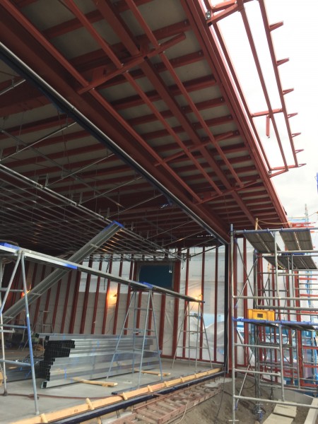
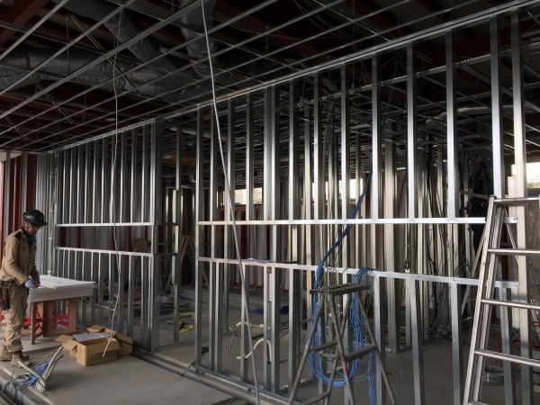
on Construction
Photography
Videos
WAF2017, the World Cup of Architecture, took place in Germany this year.
Our firm made it to the finals in both the architecture and spatial design categories and gave a presentation in Berlin.
Awards
- International Architecture Awards
- DESIGN FOR ASIA AWARDS 2017 BRONZE AWARD
- JCD DESIGN AWARDS 2017 BEST100
- GOOD DESIGN AWARD WINNER
- iF DESIGN AWARD 2018
- A&D Trophy Awards 2017
- Interior Design Best of Year Honoree
- GOOD DESIGN USA
- APIDA 2017 Shopping Space Category Winner
- SPARK2017 GOLD AWARDS WINNER
- IIDA BEST OF ASIA PACIFIC DESIGN AWARD 2017
- AMERICAN ARCHITECTURE PRIZE 2017
- Red Dot Design Award
- ICONIC AWARD Winner
- A’DESIGN AWARD 2017
- IDEA International Design Excellence Awards’17
- THE PLAN AWARD
- LIXIL STORE FRONT CONTEST
Media
- China C-IDEA Design Award
- Russia Eurasian Prize Yearbook
- FRAME web
- CABLE TV “Sankanou”
- DESIGN INTERVIEWS
- SUN TV “Yoji! catch”
- designboom
- archdaily
- FRAME website
- contract magazine
- Hospitality Design Magazine
- architektur FACHMAGAZIN
- Architizer
- ArchDaily
- designboom
- Vies de Villes
- Kobe Newspaper
- FRAME
- JDN JAPAN DESIGN NET
- VIEWPOINT MAGAZINE HOLLAND
- SHOTEN KENCHIKU No.2017.5
Client Data
- Client
- Queen Doll
- Category
- Pharmacy
- Role
- New construction
- Duration
- 3months
- Gross Area
- 147.68㎡
- Location
- Minokunicho Kokubunji 153-5, Himeji, Hyogo, Japan
- Website
- godai.net

